
Gutes Reporting beginnt vor dem ersten Dashboard.
Weil Data Health, Standards und Struktur über Skalierung entscheiden.
Viele Unternehmen scheitern mit Power BI nicht an der Visualisierung, sondern an fehlender Struktur und fehleder Datenqualität.
Ich helfe dabei, Reporting von Anfang an so aufzusetzen, dass es einheitlich, langfristig wartbar und skalierbar ist.
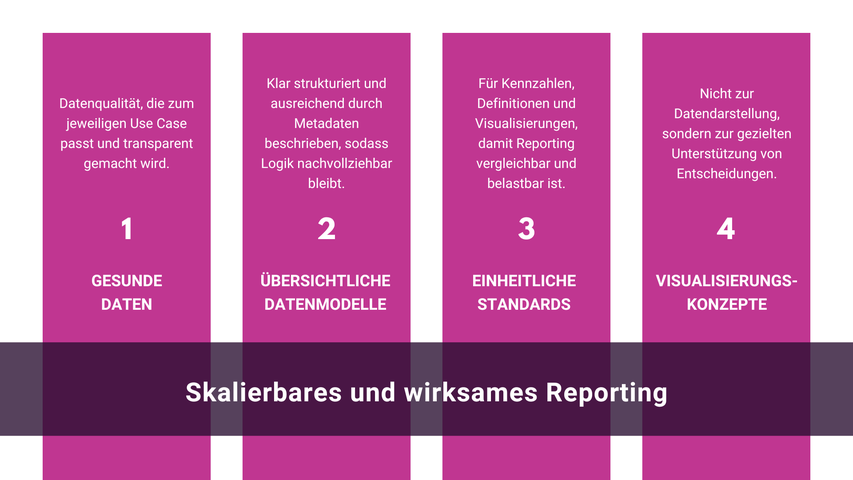
Skalierbares und wirksames Reporting mit Power BI basiert für ich auf vier zentralen Säulen.
Auch Copilot entfaltet seinen Nutzen nur mit klarer Basis
Nicht nur beim Einsatz von Power BI, sindern auch beim Einsatz von Copilot und KI zeigt sich, wie tragfähig diese Grundlagen wirklich sind.
KI kann nur dann sinnvoll unterstützen, wenn Daten, Modelle, Metadaten und Standards klar definiert sind. Andernfalls verstärkt sie bestehende Unschärfen statt
Klarheit zu schaffen.
Herausforderungen, die ich in BI-Projekten regelmäßig sehe
Viele meiner Kund:innen kommen mit ähnlichen Herausforderungen zu mir:
- Power BI wird zwar genutzt, es gibt jedoch keine einheitlichen Definitionen von Kennzahlen.
- Reports haben lange Ladezeiten und liefern inkonsistente Ergebnisse.
- Datenqualität ist ein Dauerthema, es wurden dafür aber nie klare, belastbare Kriterien definiert.
- Dashboards haben kein einheitliches "Look and Feel" und sind dadurch unübersichtlich.
- Reports und Dashboards sind vorhanden, werden im Alltag jedoch kaum genutzt.
- Es wurde mit einzelnen Reports gestartet, inzwischen gibt es Auswertungen für mehrere Bereiche. Standards und Strukturen wurden jedoch nie konsequent nachgezogen.
- Mitarbeitende wünschen sich Unterstützung im Umgang mit Power BI, es fehlt jedoch an klaren Leitplanken und Orientierung.
Genau hier setze ich an und unterstütze dabei, Haltung, Strukturen und Strategien zu entwickeln, die für mehr Klarheit, Verlässlichkeit und tatsächliche Nutzung sorgen.
Mein Ansatz für wirksames Reporting
Mir ist es ein Anliegen, einzelne Dashboards nicht isoliert zu betrachten, sondern eine gesunde Basis für skalierbares, belastbares Reporting zu schaffen.
Mein Fokus liegt darauf, Power BI so aufzusetzen, dass es auch bei wachsenden Anforderungen stabil bleibt und Entscheidungen verlässlich unterstützt.
Dabei folge ich einigen klaren Prinzipien:

So entstehen Power-BI-Lösungen, die nicht nur heute funktionieren, sondern auch dann noch tragen, wenn neue Anforderungen, neue Nutzer:innen oder neue Technologien dazukommen.
Formate der Zusammenarbeit
Workshop & Sparring

Für Unternehmen, die ihre Power-BI-Landschaft nicht nur betreiben, sondern wirklich verstehen und nachhaltig weiterentwickeln möchten.
Im Fokus stehen Klarheit bei KPIs, Datenmodellen, Reporting-Strukturen und Entscheidungslogiken. Gemeinsam analysieren wir bestehende Herausforderungen, identifizieren ungenutzte Potenziale und schaffen Orientierung zwischen Business, BI und Technologie.
Besonders hilfreich, wenn Power BI bereits im Einsatz ist, aber Themen wie Governance, Standards, Nutzerakzeptanz oder gewachsene Strukturen zunehmend Komplexität erzeugen.
Mögliche Themen:
- Anforderungsmanagement,
- KPI-Definitionen & Kennzahlenlogik,
- Datenvisualisierung & Data Storytelling,
- Data Health & Standards,
- Metadaten & BI-Reife,
- Governance & Skalierbarkeit sowie
- Einordnung von Power BI, Copilot und KI.
Konzeption & Aufbau
Aufbau und Weiterentwicklung skalierbarer Power-BI-Strukturen mit klaren Standards, nachvollziehbaren Datenmodellen und benutzerfreundlichen Reports.
Ziel ist nicht mehr Komplexität, sondern eine BI-Landschaft, die verständlich, wartbar und nachhaltig nutzbar bleibt.
Mögliche Inhalte:
- Modell- und Reporting-Architektur,
- Standardisierung bestehender Reports,
- Weiterentwicklung von Governance-Strukturen,
- Konsolidierung historisch gewachsener Lösungen,
- Optimierung von Datenmodellen & Performance,
- Visual Design & Nutzerführung sowie
- KPI- und Reporting-Konzepte.
Formate
Die Zusammenarbeit kann flexibel an Zielsetzung, Teamstruktur und Reifegrad angepasst werden.
Mögliche Formate:
- Workshops,
- Strategieworkshops,
- Projektbegleitung,
- Executive Sparring,
- 1:1 Coaching und
- Review & Health Checks.
Enablement & Schulungen zu Copilot und KI

Ich unterstütze Teams dabei, Copilot und KI sinnvoll in ihren Arbeitsalltag zu integrieren, unabhängig von Power BI oder klassischem Reporting.
Im Fokus stehen nicht Funktionen oder Prompts, sondern der verantwortungsvolle Umgang mit KI im Kontext von Entscheidungen, Wissen und Zusammenarbeit.
Mögliche Inhalte:
-
Einordnung von Copilot im Arbeitsalltag
-
Wann Copilot unterstützt und wann nicht
-
Arbeiten mit Kontext, Struktur und klaren Fragestellungen
-
Grenzen von KI und typische Fehlannahmen
-
Verantwortung, Interpretation und Qualität von Ergebnissen
-
Zusammenspiel von Mensch, Prozess und KI
Die Schulungen sind praxisnah, reflektiert und richten sich an Fachbereiche, Teams und Führungskräfte, die KI nicht als Spielerei, sondern als Arbeitsmittel nutzen möchten.
Unternehmen, die zu mir passen
Meine Arbeit richtet sich an Unternehmen, die merken, dass Power BI zwar vorhanden ist, aber sein Potenzial nicht ausspielt.
Oft sind Daten da, Reports auch, aber Klarheit, Konsistenz und Vertrauen fehlen.
Eine Zusammenarbeit passt gut, wenn Sie KI und BI nicht nur „betreiben“, sondern als verlässliche Grundlage für Entscheidungen nutzen wollen.
Wenn Sie bereit sind, vor dem nächsten Dashboard kurz innezuhalten und sich mit Struktur, Datenqualität und Standards zu beschäftigen oder wenn Sie Copilot nicht isoliert einsetzen möchten,
sondern Klarheit darüber suchen, wo KI unterstützt und wo menschliche Entscheidung bleibt.
Typischerweise arbeite ich mit Unternehmen, die:
-
Power BI bereits nutzen oder gerade einführen
-
Reporting über mehrere Bereiche hinweg konsistent aufsetzen wollen
-
merken, dass KPIs diskutiert werden, statt zu unterstützen
-
Datenqualität nicht perfekt, aber bewusst handhabbar machen möchten
-
verstanden haben, dass Skalierung ohne Struktur nicht funktioniert
-
Fachbereiche und BI nicht trennen, sondern zusammenbringen wollen
Wenn Sie das Gefühl haben, dass Power BI bei Ihnen mehr leisten könnte, als aktuell möglich ist, lassen Sie uns sprechen.
Hinterlassen Sie mir eine Nachricht und wir analysieren gemeinsam, wie gut Ihre aktuelle BI-, Daten- oder KI-Landschaft aufgestellt ist und wo echte Hebel für bessere Entscheidungen liegen.
Insights rund um interaktive Dashboards, Reports & Power BI
Fragen und Antworten rund um das Thema Power BI, Dashboards & Reports finden Sie HIER.
Aktueller Newsletter

Warum Schweigen gefährlicher wird als Fehler!
Wir reden viel über KI. Aber über das, was sie mit Menschen macht, oft gar nicht.
In diesem Artikel geht es darum, warum Schweigen im KI Kontext gefährlicher ist als Fehler. Warum psychologische Sicherheit zum entscheidenden Erfolgsfaktor wird und weshalb nicht die Technologie Menschen irrelevant macht, sondern Kulturen, in denen niemand mehr sagt, dass er gerade nicht mitkommt.
Ein persönlicher Blick aus Workshops, Projekten und Gesprächen dort, wo KI bereits Realität ist.
👉 Weiterlesen, wenn du typische Fehler bei der KI-Einführung vermeiden willst.